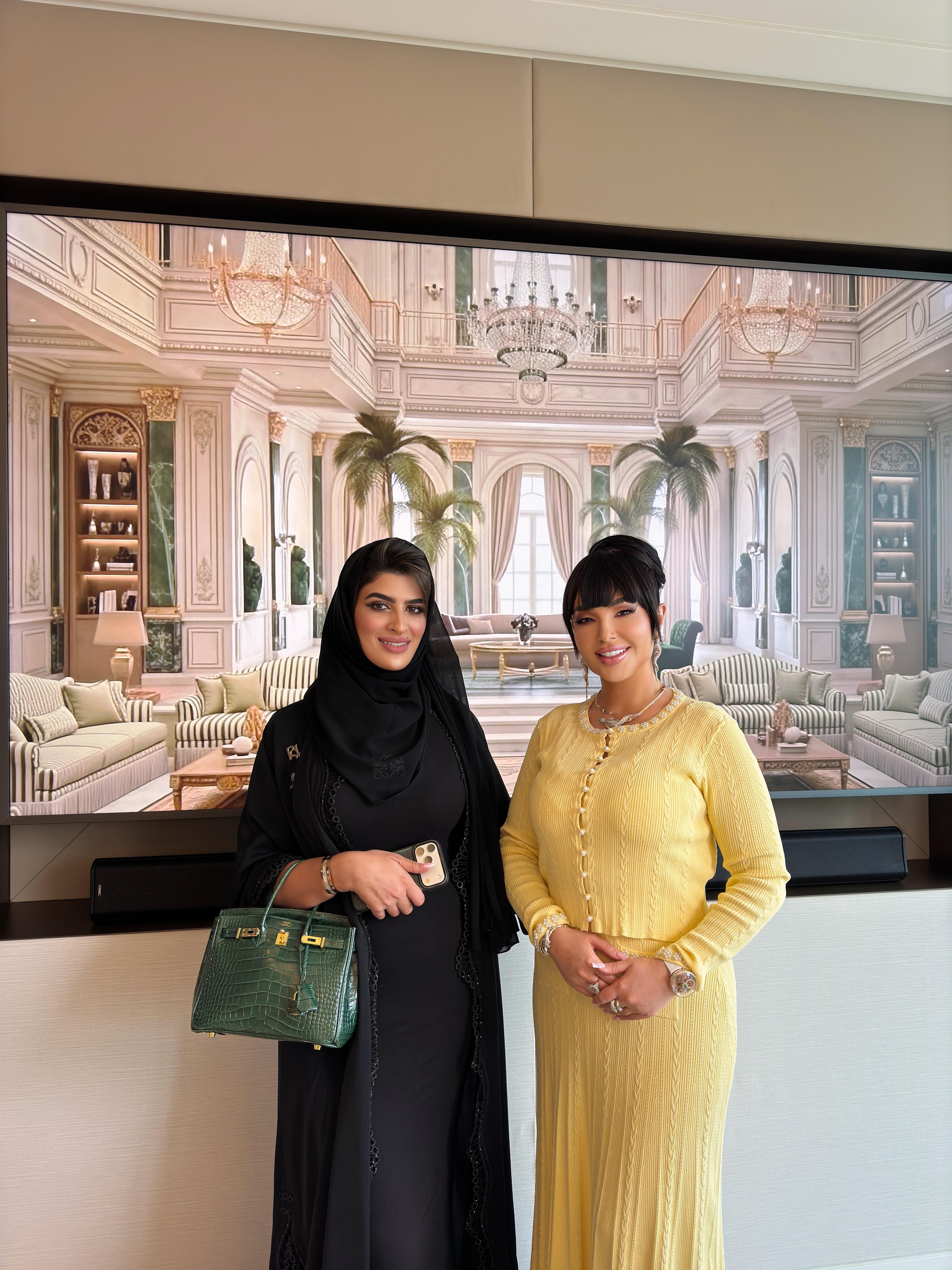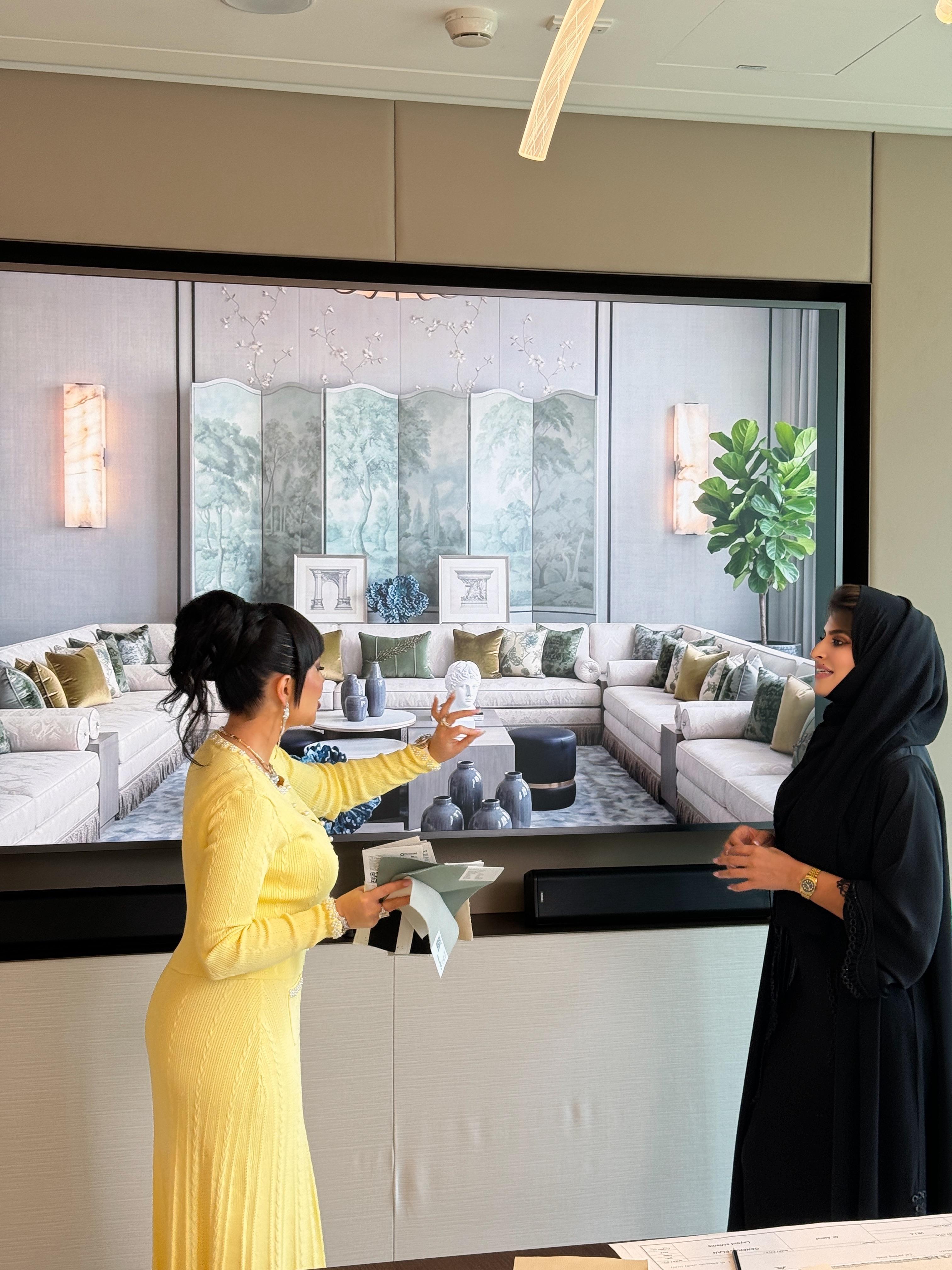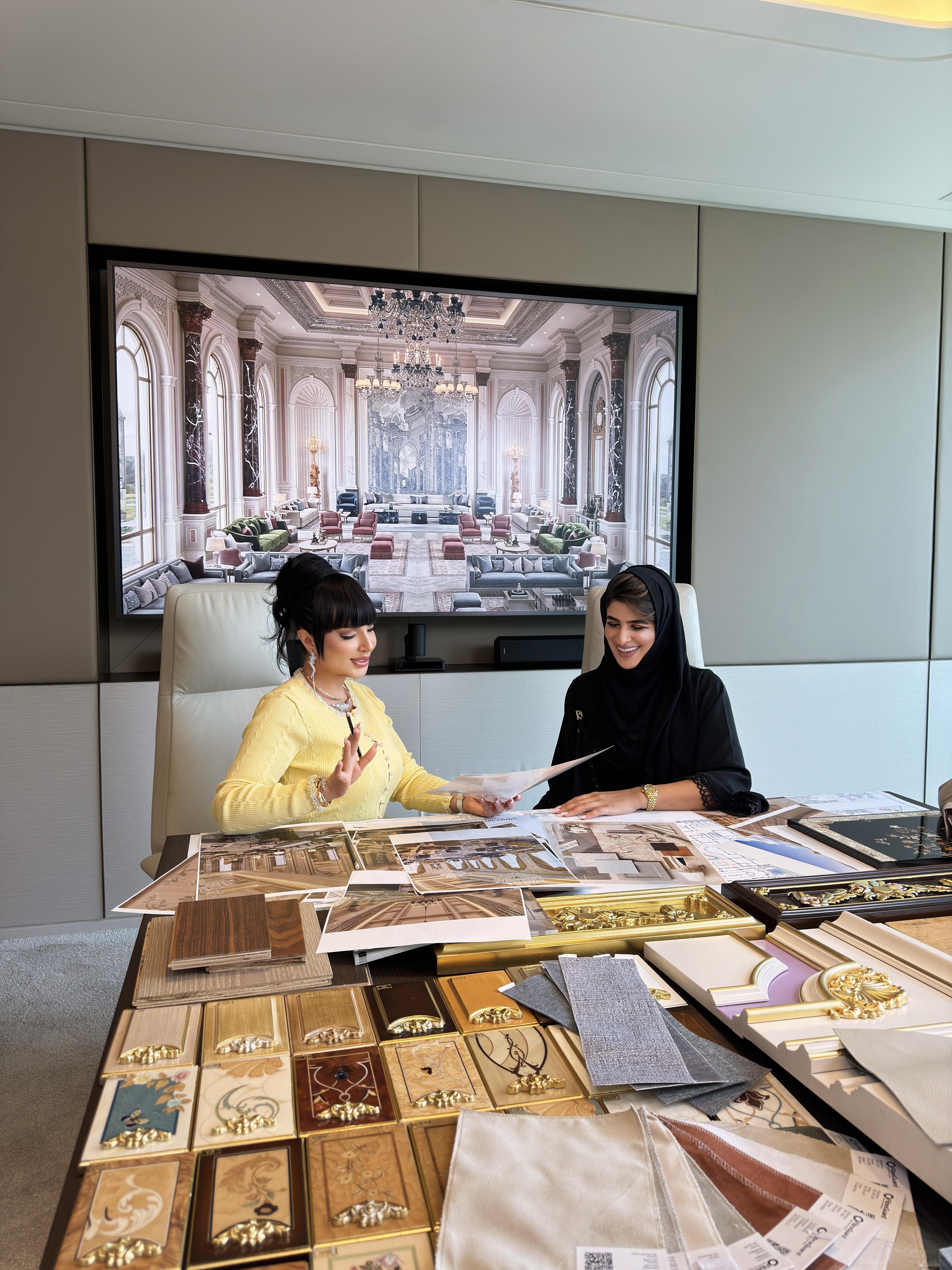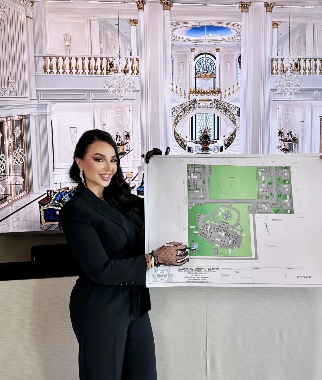
THE ART OF COLOR COORDINATION
The color of your dining room is probably one of the most important things to consider when you are planning to have a sumptuous dinner, after all the color and the paint will give the whole mood of your place. Pair colors with lighting and fixtures like contemporary chandeliers. In Luxury Antonovich Design, we have mastered the art of doing the right color. From creating our own unique pantones to incorporating superb color combination, we are confident to say that our forte is doing colors. In this article, you will learn the basics of choosing the right color for your room, and you will also be equipped with the needed knowledge in color combination.
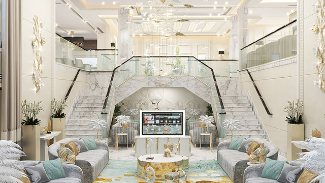
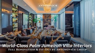
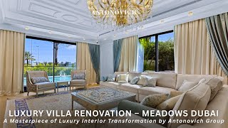
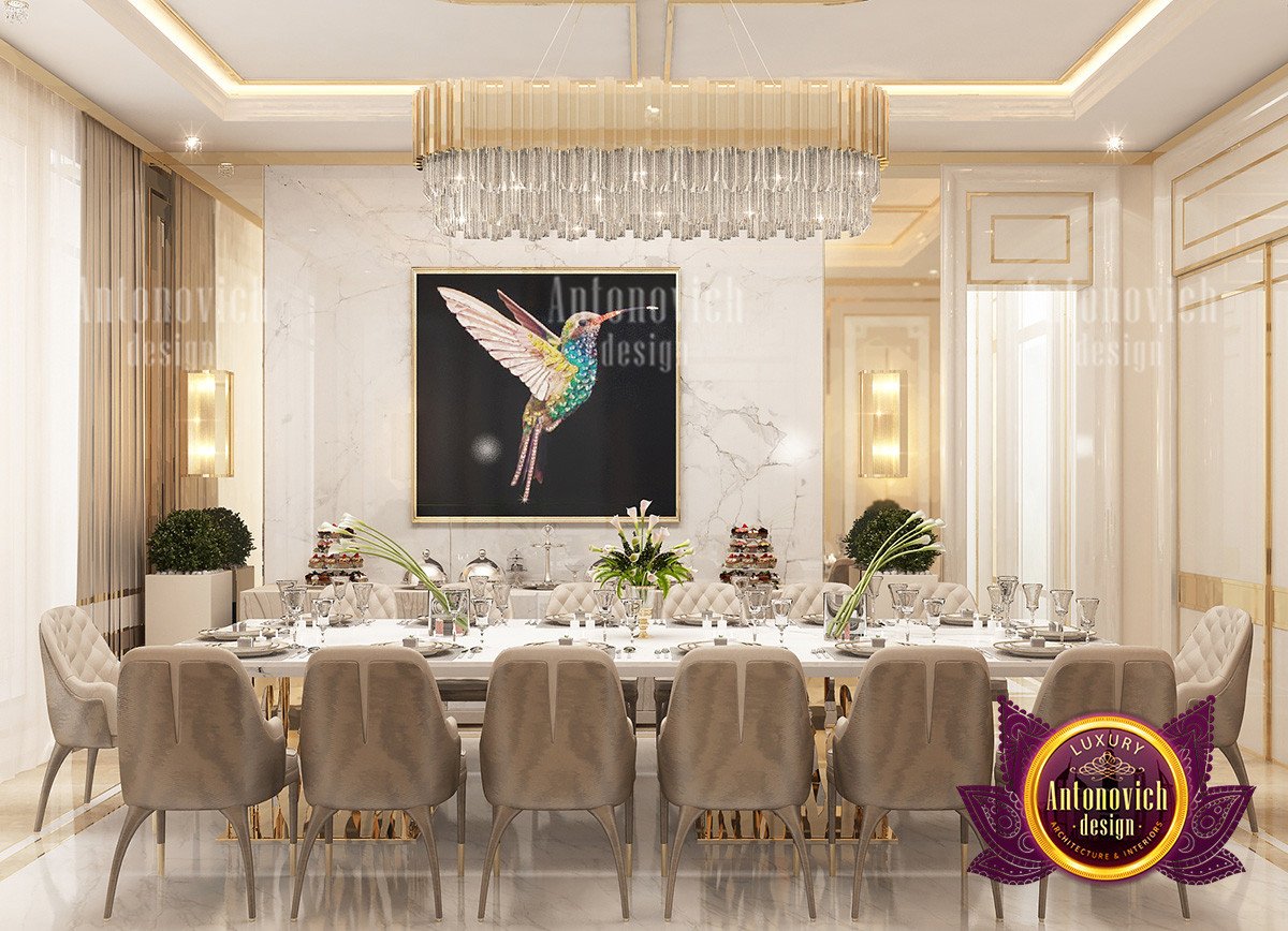
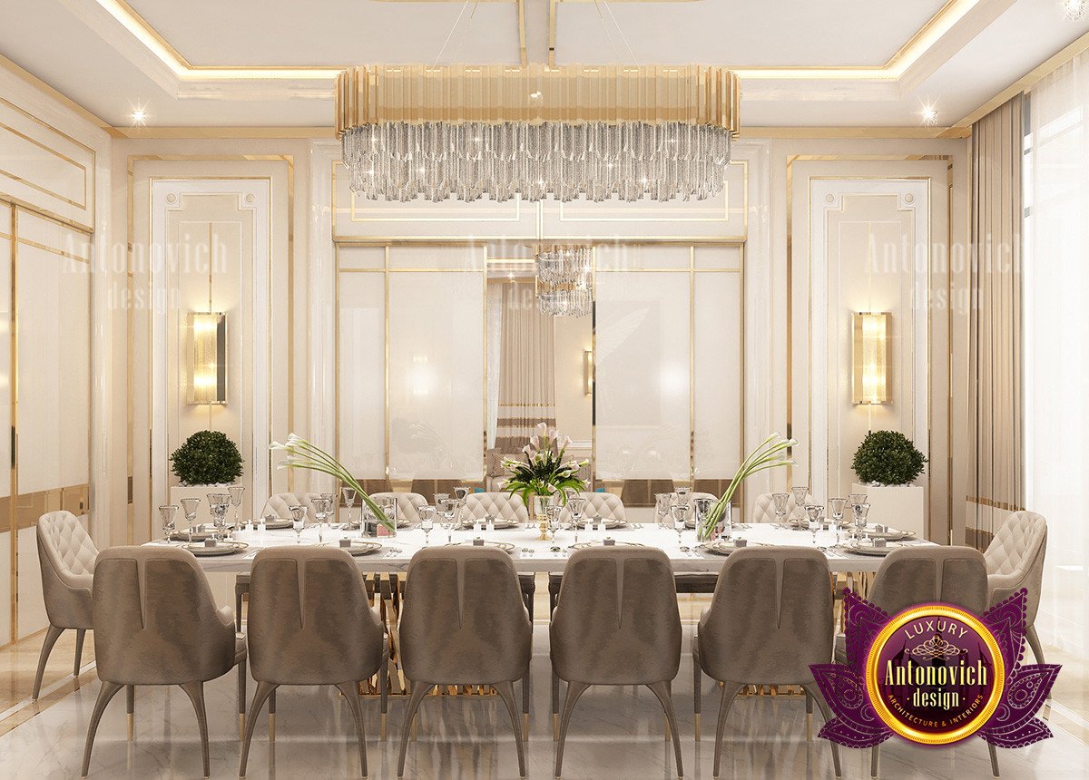
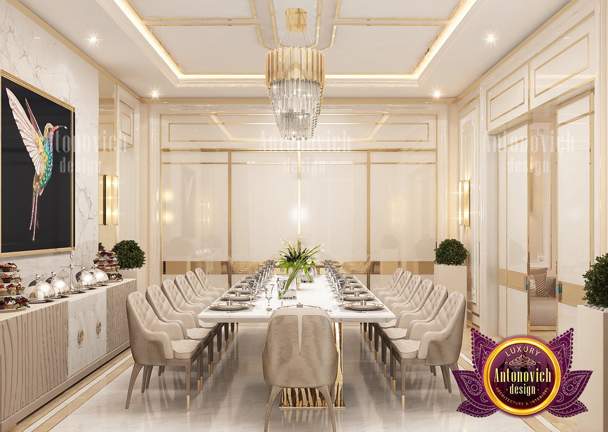
In the interior design featured in this article, you will notice the big use in gold. A color that is luxurious and soothing. The color that provides such elegance and richness to one’s interior design. Moreover, the color gold is partnered with colors brown and pale white. These color combination would give the right amount of darkness and lightness that the dining area needed. Pair these palettes with complementary kitchen furniture ideas to complete the look.
COMBINATION OF LIGHT AND DARK
In every work of art, not just in interior design, but also in any form of design: be it a painting, a digital art, a film, a stage design, everything must be coordinated. It is important to note the difference between the hues and the saturation to use. One of the top secrets is going back to your color wheel. Are the colors complementary? Are they on the same shade? These questions should be considered first before doing the mix and match. It is important to note that every color has its corresponding partners and some colors just do not go as good with other colors. The same rules apply across different project types, including commercial interiors such as cake shop interior design.
HAVING THE SAME SHADE OF COLORS
Luxury Antonovich Design does color combination perfectly, as evident on our website’s blog posts, including examples of luxury bedroom interior design. We value every color and we always want a luxury feel into it: no matter how small, how huge your area is. Doing the same shade of colors is nothing new to us. And we want to share one huge secret that until now we hold on to you must have the eye for beauty. The colors are synonymous to beauty for us. And beauty is universal. Hence, having a beautiful color combination for us, in Luxury Antonovich Design, is something that each and everyone should be aware of.
We like it better with the right colors because we see it as an opportunity to liven up the space, to make the are much bigger, and to have a better dining experience all in all. Consider the overall plan when choosing palettes so colors flow through rooms and outside; even your luxury house plans and exclusive exterior design benefit from coordinated palettes. For a cohesive home feel from dining to rest, explore comfortable bedroom design. If you have children, think about nearby spaces too and use gentle contrasts in the kids' room interior design to keep the whole home harmonious.