GOLDEN IS A NEW BLACK
Luxury Antonovich Design is inspired by nature. Its naturalness, environmental friendliness, simplicity. Especially strong we love shades of nature. Have you ever seen the blue color of the South Sea and the bright highlights that the sun draws on its surface? Have you enjoyed the color of the stone in the rock, the juicy green color of the may grass?
We also develop related landscape concepts for exteriors and gardens — see our landscape design in Riyadh.
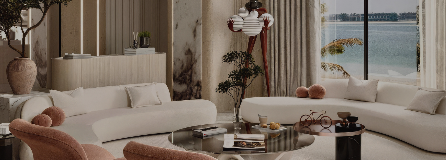
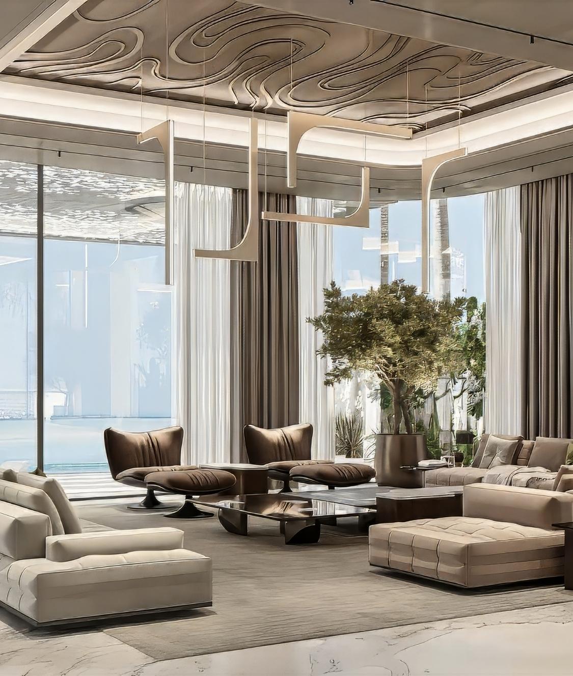
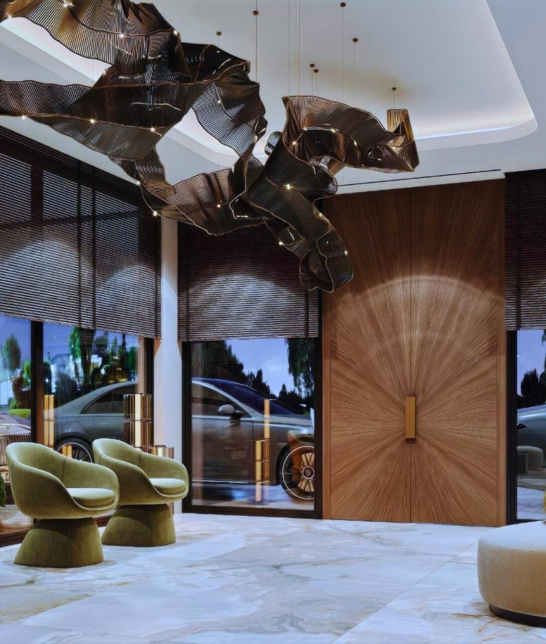
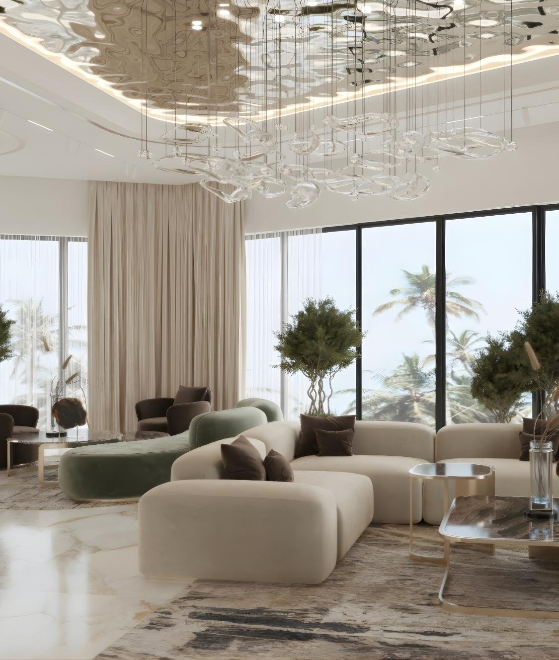
This love has coincided with the fashionable colors of this year, given the trends in interior design — the colors of nature, forest, park, sea, flowers, terracotta, pastels, life. When creating our interiors, we use them in natural fabrics, natural wood and metal.
We source luxury fabrics from lines such as CAVALLI HOME.
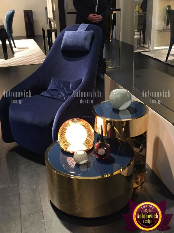
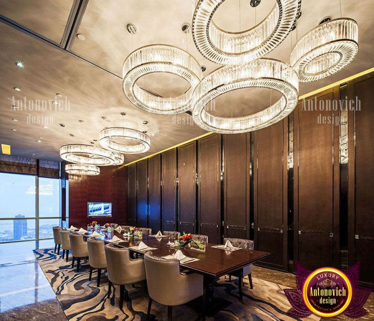
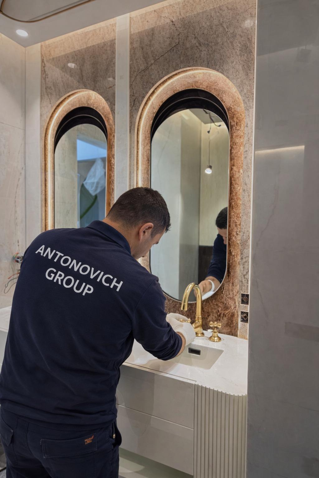
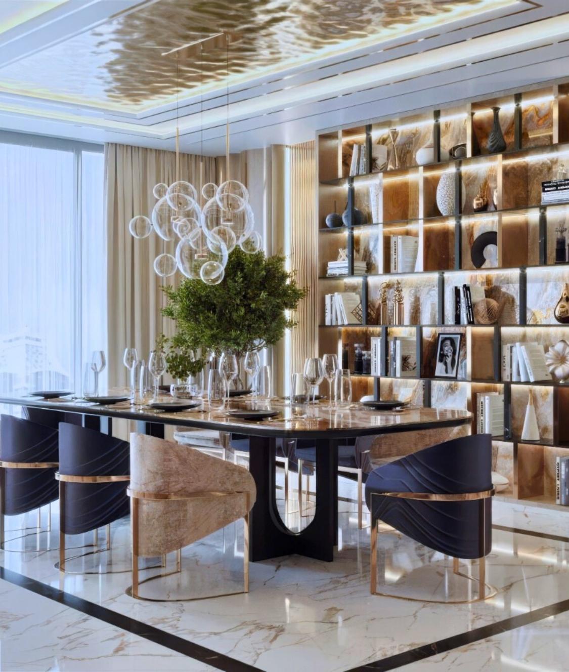
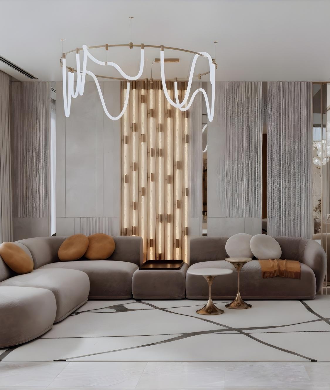
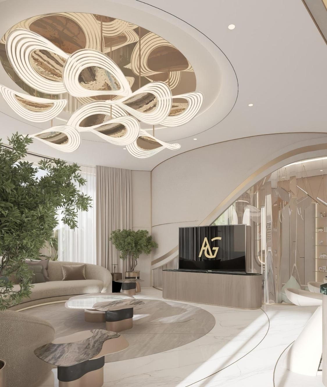
Did you know that golden color is in trend of interior design again? Imagine — the golden color of one of the living room walls, which gives a rich new depth to the whole image. The golden color of fabric, which upholsters a sofa by KA Furniture, or maybe its just a pillow — like gold splashes. The golden color of lamps, plumbing and other accessories — Luxury Antonovich Design is not far behind the modern style, which is able to make your home beautiful! Agree, it is fresh, it is original, it is stylish. Golden color will instantly make your interior original, unlike any other.
We also advise on facades and outdoor finishes — see best exteriors UAE.
INTERIOR COLOR TRENDS FROM ANTONOVICH TEAM
For you, Katrina Antonovich and her designers team have prepared a selection of fresh ideas using color for colorful interior decoration:
They include practical tips for other rooms and kitchens; explore luxury kitchen design trends.
1. Festive orange.
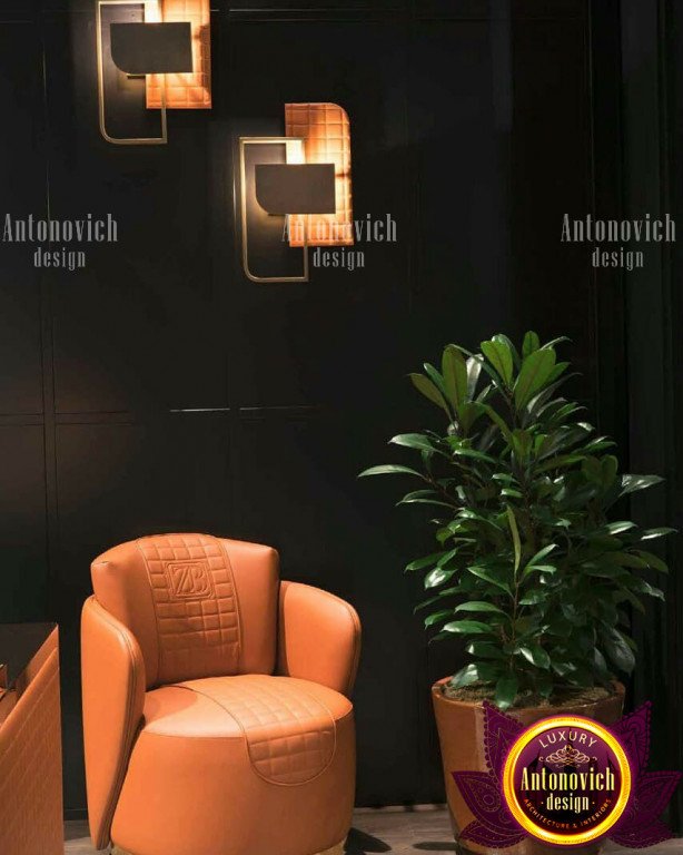
This juicy, sun-saturated color will be a bright accent in the interior. For example, a pillow on the couch, drapery on curtains, a vase.
This hue works especially well in a Coze kids bedroom.
2. Saturated red is a shade of burgundy, red wine.
The color of sunset, evening. It will give depth to any image, intrigue. But it also gives respectability and chic in the design of the house or a respectable restaurant.
3. Sweet lilac — it is still the color of ripening lavender, — very creative. The interior will be given a flour of romance, reverie, and will be a great contrast to other more saturated colors.
Lilac makes a charming choice for children; see our kids bedroom interior ideas.
4. Complicated navy blue.
The color of the dark sky. Like Bordeaux, it is designed to deepen the image. On the one hand, a serious classic shade. On the other hand, it can be given to dreaminess and new perception by adding a contrasting color.
Navy can frame aquatic spaces beautifully — explore indoor swimming pool design ideas.
5. Brown granite.
This is the shade of the earth. Reminds hot chocolate that is spilled on the tablecloth. It calls for naturalness, perfectly dilute the black and white palette. And it will definitely create comfort — warm, homely, eternal.
For furnishings that suit warm palettes, check a nearby girls bedroom furniture store.
All projects coordinate with MEP contracting companies in Dubai to integrate systems seamlessly.


